BERKSHIRE MS THERAPY CENTRE RE BRAND
Logo | Marketing | Web design | University project
Finding individuality and purpose in a crowded field
Who are we? ….
Founded in the 80s by people who suffer with MS, MS Therapy centre Berkshire aim to support people living with Multiple Sclerosis, helping them and their families to live a life that is as easy and comfortable as possible.
We refer to people who use the centre as members not patients, to stop the stigma of people who use the centre being seen as sick.
Offering a range of treatments, from physio and foot care, all the way to offering support and therapies for our members and their families and friends.
CURRENT LOGO
The client felt the current logo aligns too closely to the NHS. As a separate organisation, Ms Therapy Centre Berkshire wanted a way to differentiate themselves.

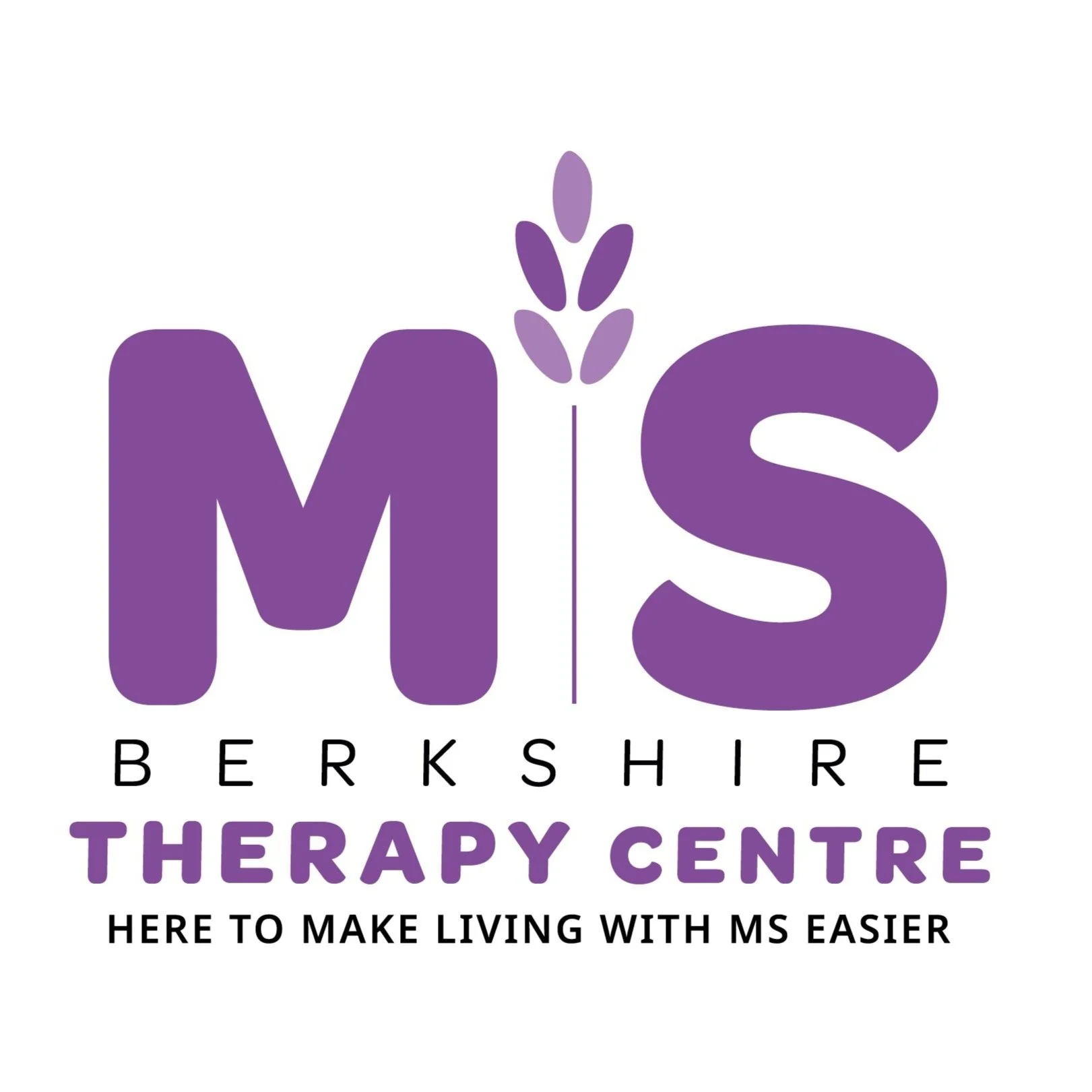
NEW PROPOSAL
Our logo is the most important asset to the branding of MS Therapy Centre Berkshire.
The logo is symbolic of the kind and welcoming nature the centre provides to our members. Lavender embodies this nature and is a significant smell around the centre to relax our members, hence the use of it in our logo.
The logo hierarchy reads MS Therapy Centre Berkshire with the brand strap line below.
NEW WEBSITE
Our website allows for a swift process to making a donation, a process we felt was too prolonged in the previous website, leading to some confusion as to how to donate.
Our new donations page is easy to use, from the home page you select donate, which will take you to the donations page, where you can select to either make a single or monthly payment, choose your amount and pay from a variety of payment options.

BRAND GUIDELINES AND CLIENT PITCH DOCUMENT
This project was undertaken whilst at university, working alongside real clients and learning the full process in how to build a brand, including brand guidelines. As a team we then had to pitch the rebrand to the client, receiving really positive feedback from all of their management team and members.


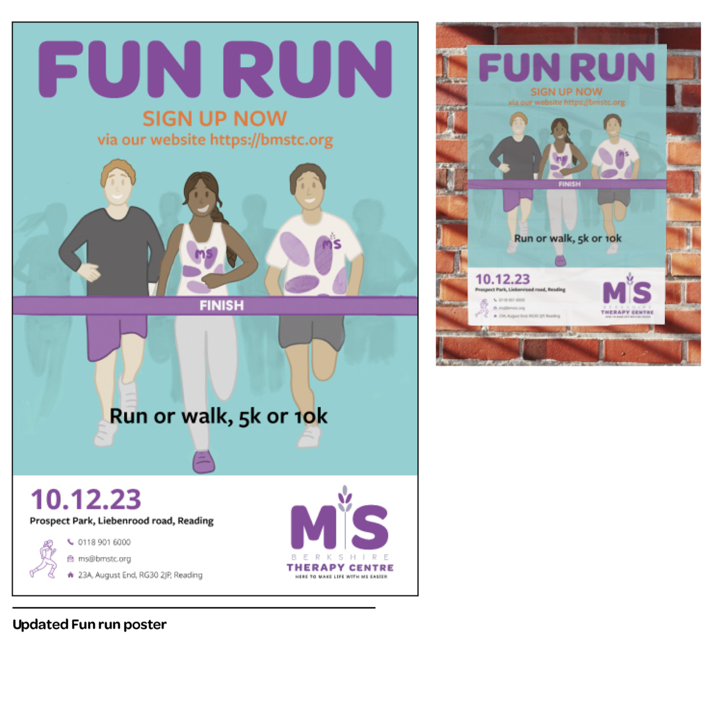
Event collateral


Event collateral including a leaflet to hand out, merchandise which includes tshirts and tote bags and posters for the events, for example the fun run shown in the far right. Illustrations were used to tie the brand together and give a feel of a friendly and inclusive community.
Illustrations and Icons
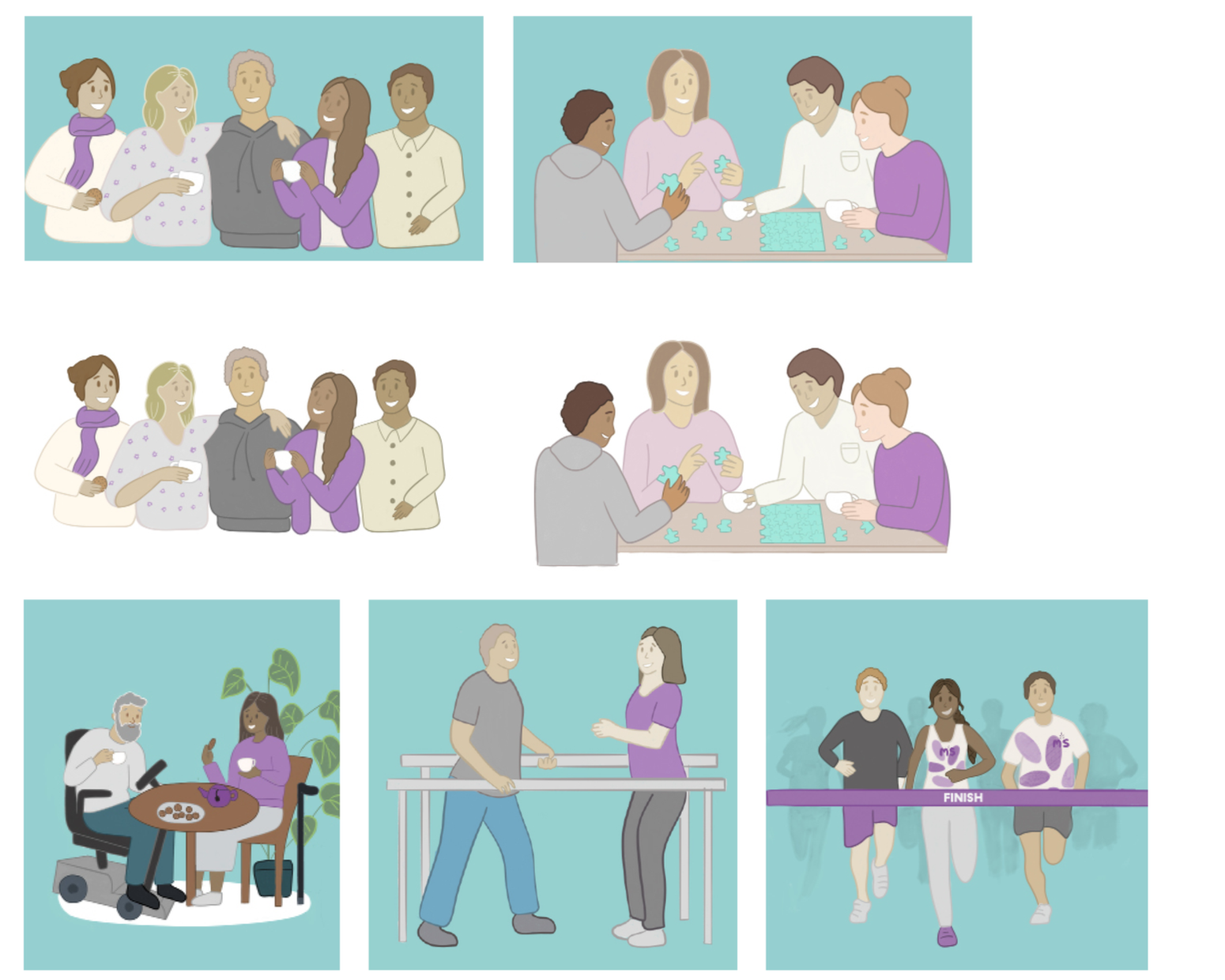

The illustrations were introduced as the team felt compared to images they’re more respectful and welcoming.
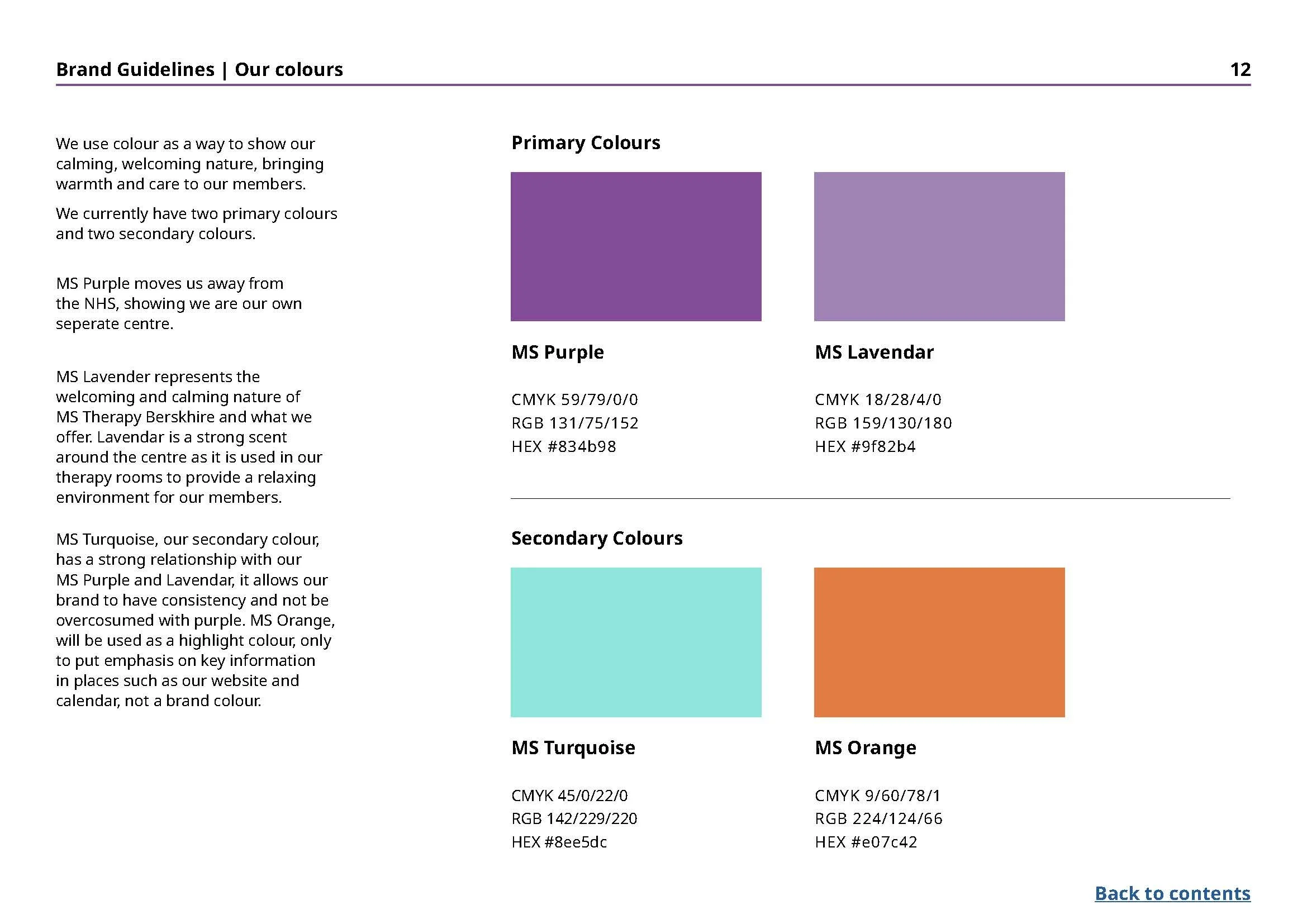
They also encourage inclusion and diversity. The images provided were of a low quality and lacked diversity. We used purple in all illustrations to keep consistent with our colour palette.
The icons correspond with the same warm and welcoming feeling that we have consistently used throughout the brand.
They communicate consistently throughout the brand to guide people to the right places on social media and the website.
Using icons creates a simple way of communicating and navigating information, whilst in keeping with the colour palette.
To see more of this projects brand guidelines and pitch document please click the button below:
Additional work
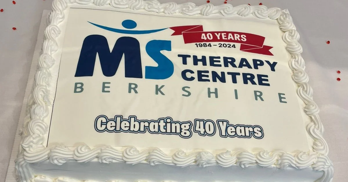
Upon completing the rebrand, I worked further with the charity. They decided to remain with the existing logo due to it being their 40th anniversary. The Charity wanted an adaptation of their current logo to mark the occasion. The initial colour chosen was ruby, with that being the traditional gemstone to mark the occasion. However the charity did not like the colour, as they felt it was too dark and didn’t feel like it was celebrating, so opted for a slightly more pink/red to give the logo some lift and a feel of celebration.