Prints
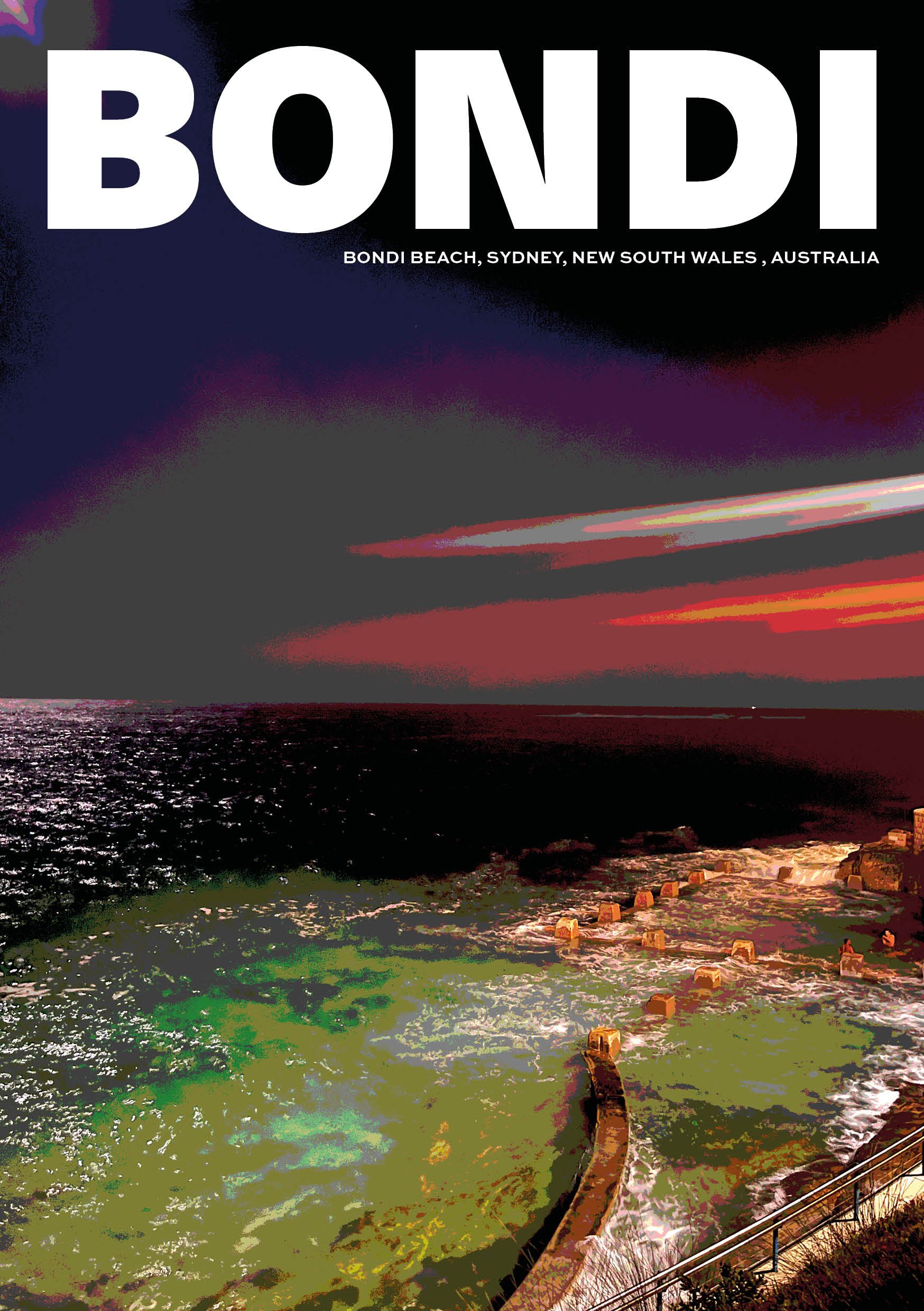
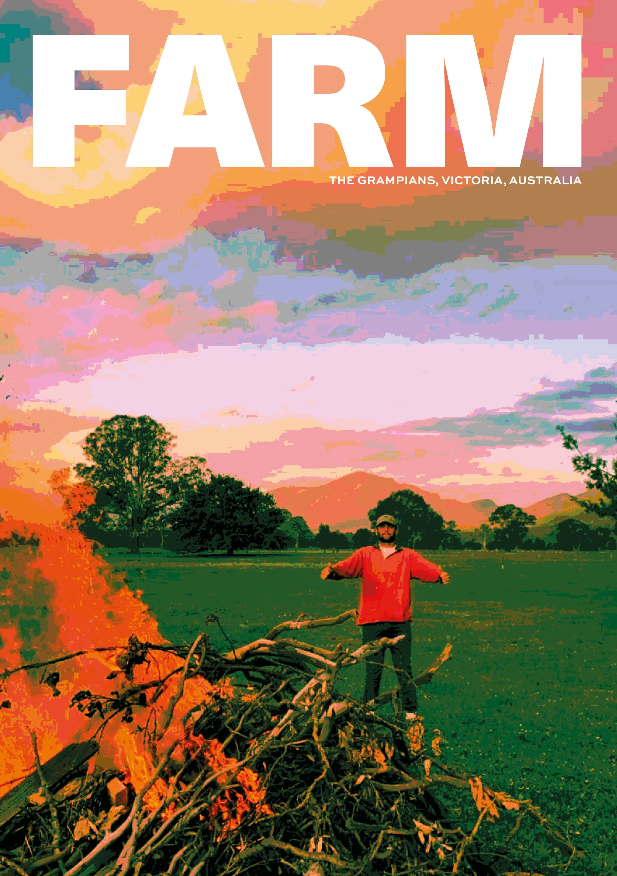
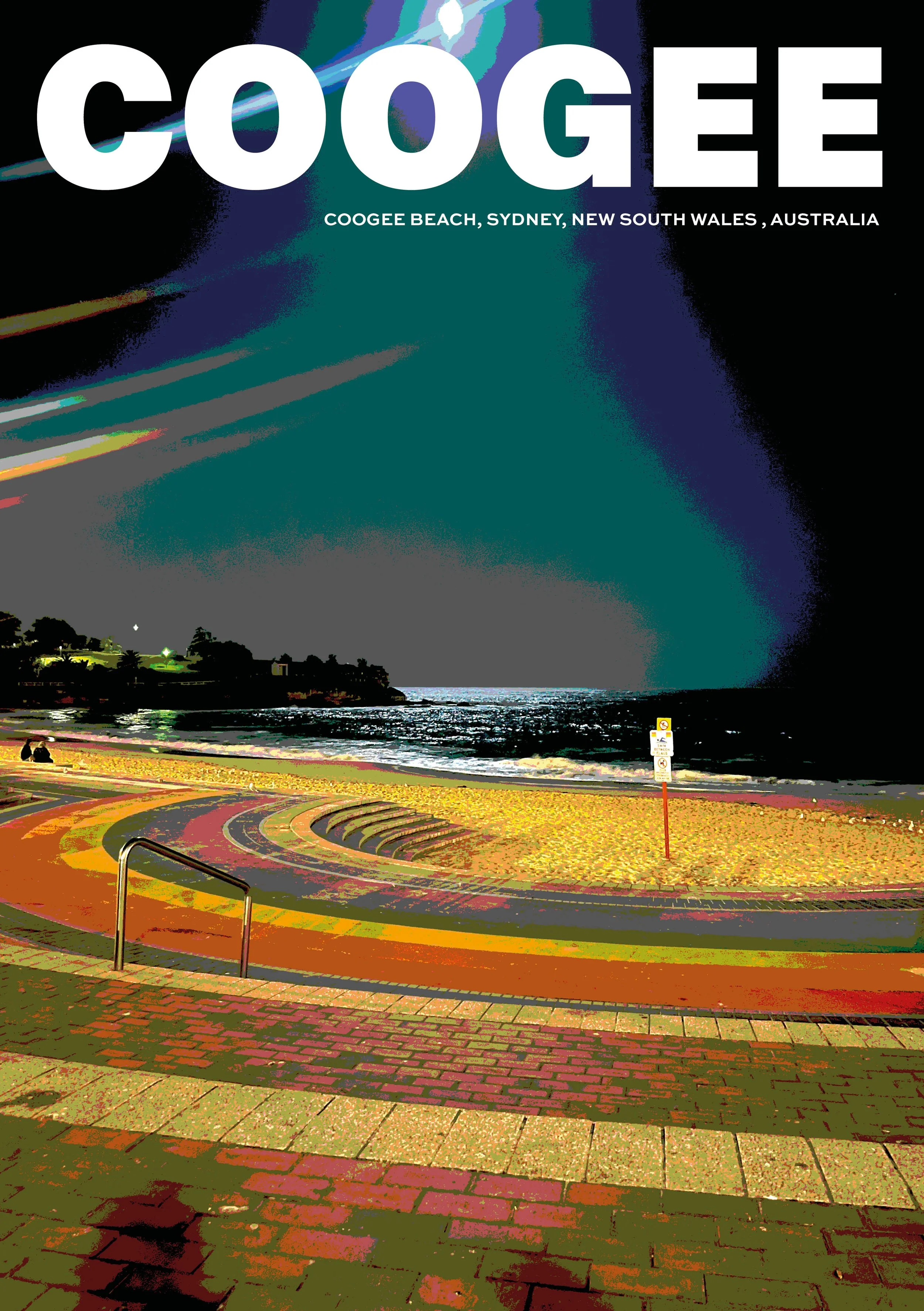
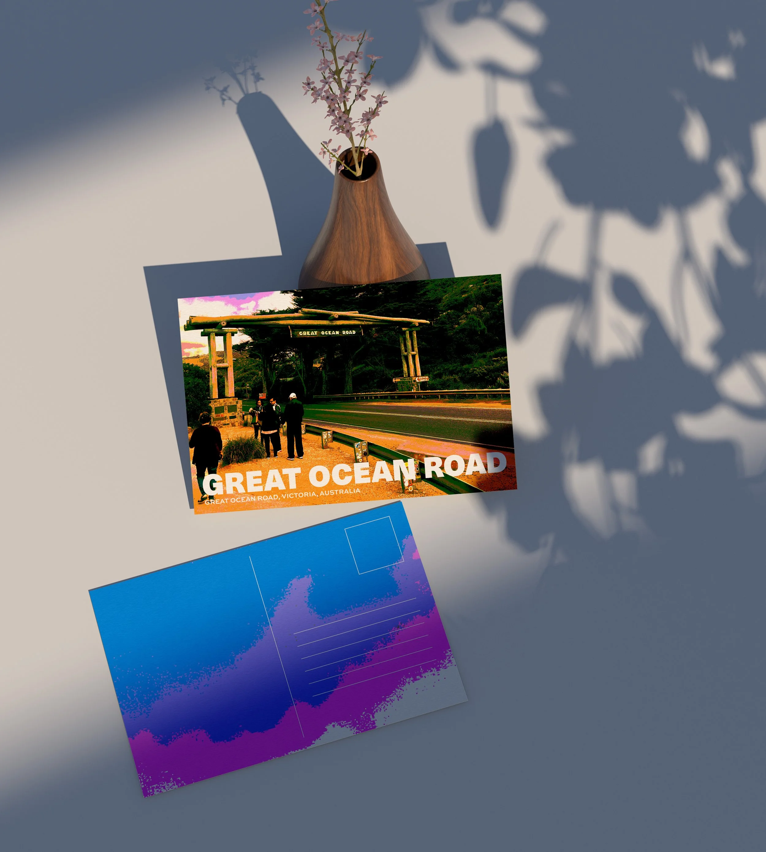
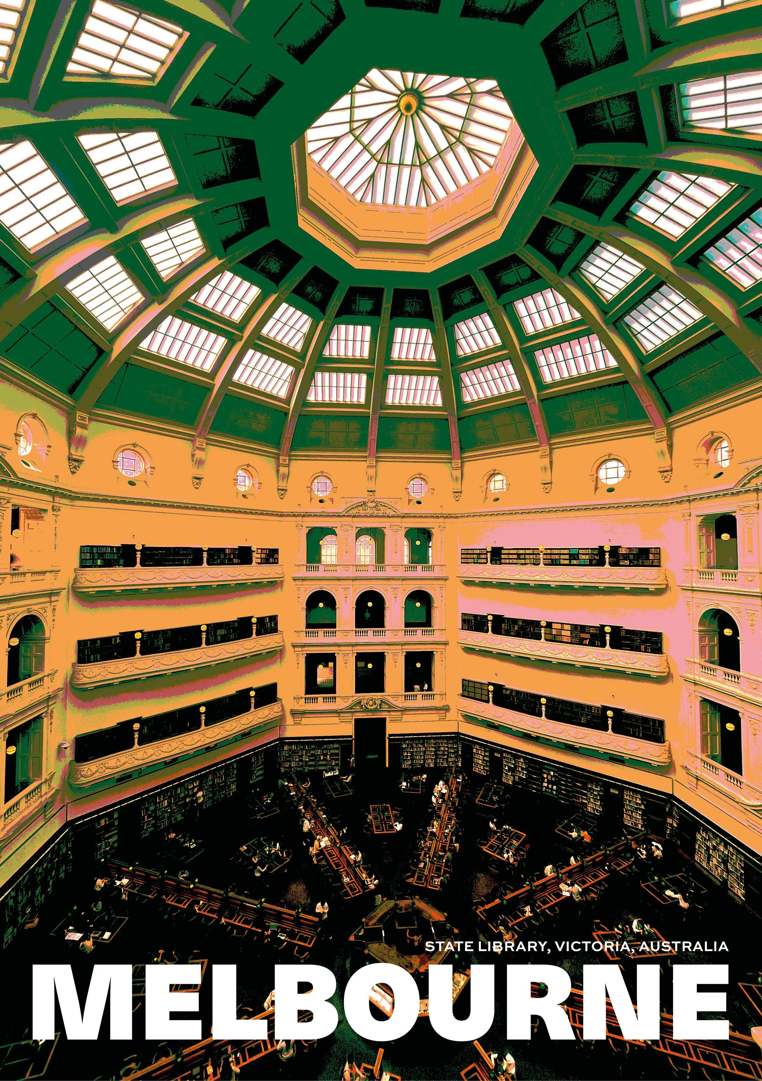
Having been fortunate enough to travel to a number of places around the world, I wanted to create a project that incorporated my own photography and explored the visual language of travel design.
THE CHALLENGE
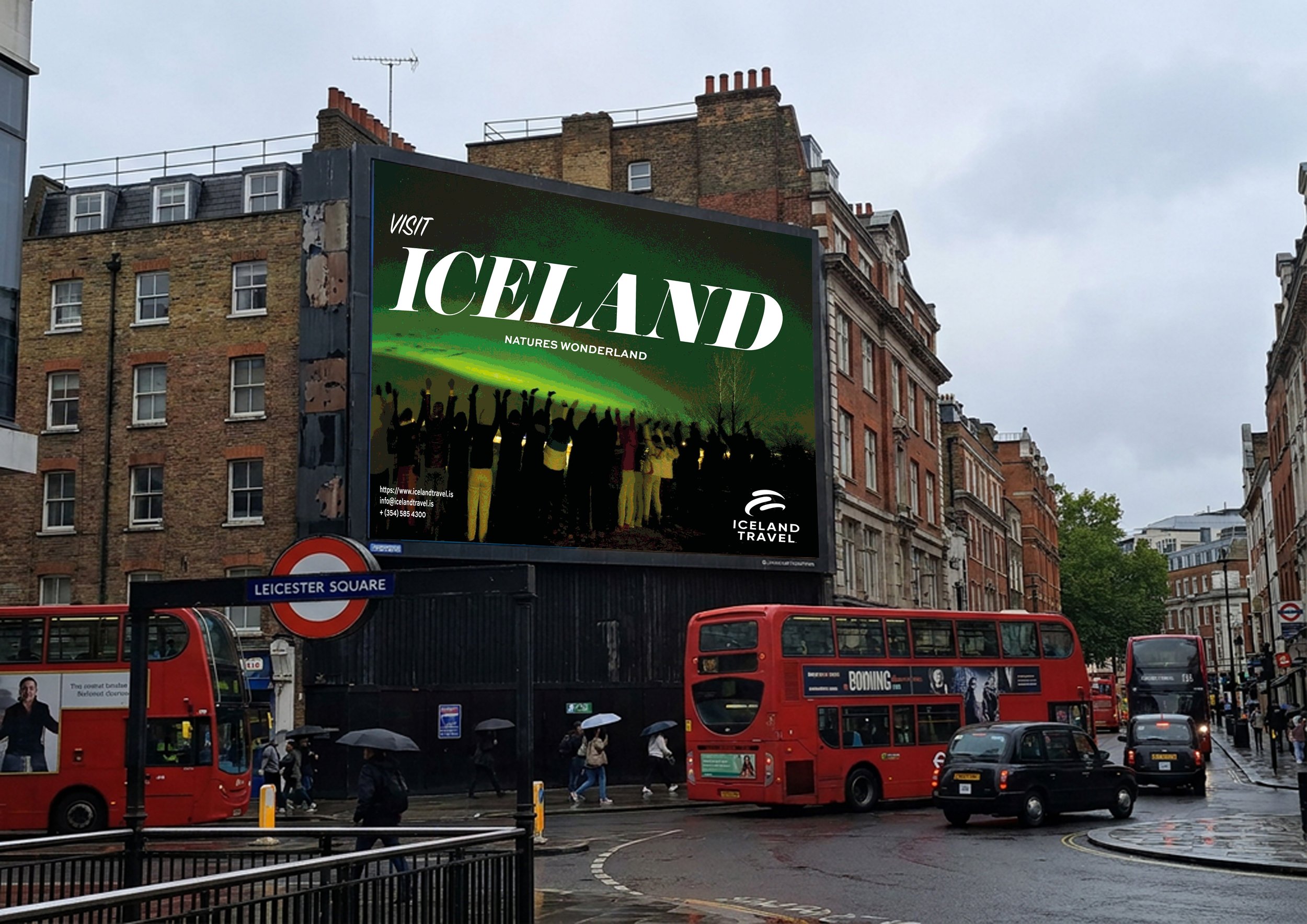
The project initially focused on creating a series of typographic prints, using large-scale type to communicate the destination and smaller type to identify the precise location. I wanted to develop the concept further by exploring how the same visual identity could be applied to different outcomes. This led to the development of a series of travel posters and postcards, allowing the photography, typography and location details to work together across a wider collection of formats
MY ROLE
Self directed project.
THE APPROACH
The aim was to create a brand mark that didn’t get lost within the standard industry norms. Looking at competitors there was a trend of wires, all using the same shapes and ideas.
Therefore the brand mark represents the values of the company, reliable, trustworthy and experienced, whilst incorporating the core of what the company do, building connecting through audio.
THE OUTCOME
The result is a flexible brand mark that works across all outputs.
Reimagining my Photography.