Berkshire MS Therapy Centre rebrand
Founded in the 80s by people who suffer with MS, MS Therapy centre Berkshire aim to support people living with Multiple Sclerosis, helping them and their families to live a life that is as easy and comfortable as possible.
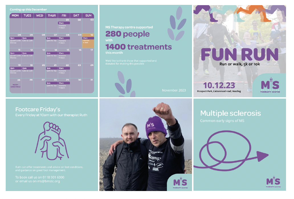
Whilst the client didn’t pursue with the branding due to upcoming events that would've meant they struggled to get outputs ready in time, they did however offer positive feedback and were delighted with the results.
THE CHALLENGE
The charity felt their current brand aligned too much with the branding of the NHS, the colours in particular were a very close match. As a completely separate organisation from the NHS, the charity wanted to move towards a brand that represented them and their individuality.
MY ROLE
University group project - Branding lead.
THE APPROACH
As a group we researched competitions, met with the client to get more of an idea of what the charity do and who they are, looked at user journeys, which helped us to develop vision and mission statements and values. We then looked at the branding, creating a brand personality wheel which helped us to see what makes up the charity as a brand.
THE OUTCOME
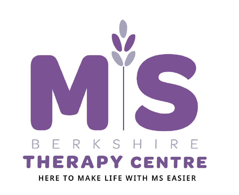
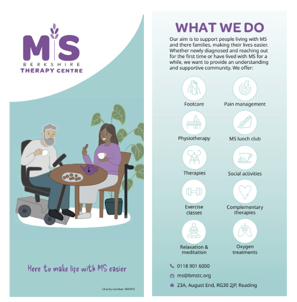
The outcome, a logo that is symbolic of the kind and welcoming nature the centre provides to its members. Lavender embodying the nature and smells around the centre which is used to create a relaxed environment.
The colour changing to purple moves the charity away from the NHS, whilst continuing with the lavender theme. The typography, much like the colours reflect the welcoming and friendly nature of the centre.
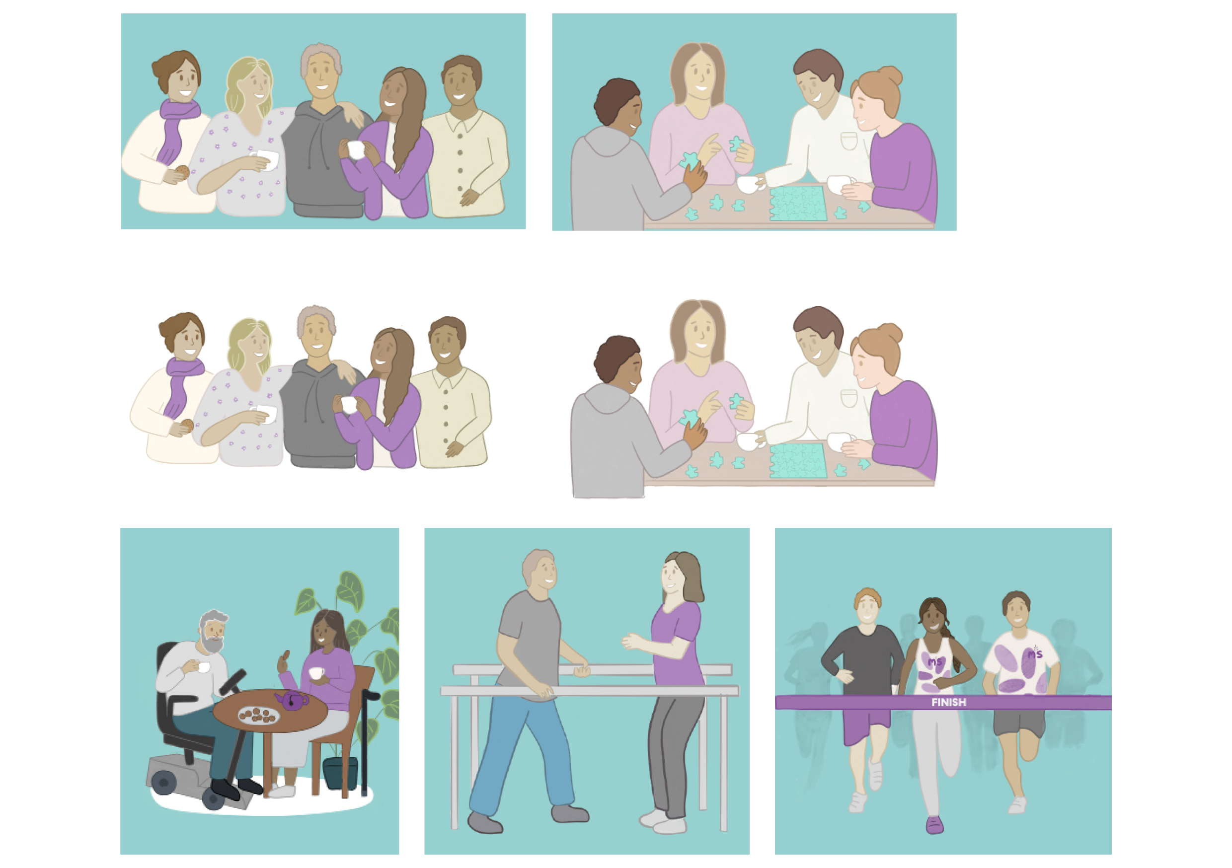
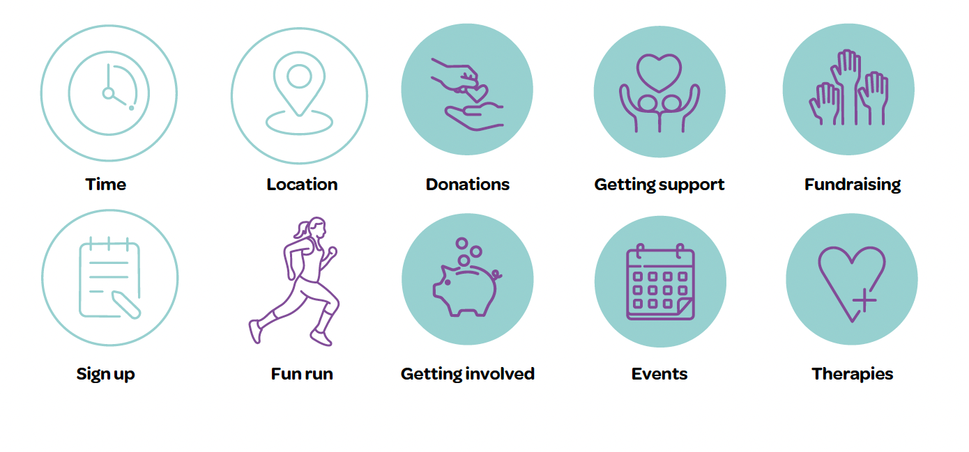
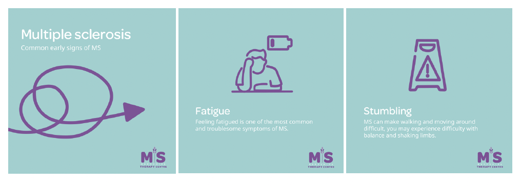
As a team we then created icons to help the centre produce outputs that are consistent, helping to guide people to the right places on social media and the website. The illustrations were a success with the charity who felt they gave a more welcoming feel compared to the photography that was initially being used.